
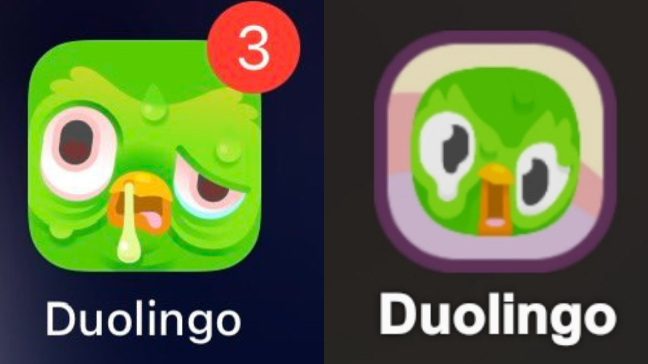
Duolingo, the widely popular language-learning app, faced a wave of reactions after altering its iconic owl mascot, Duo, in the app's icon. The once cheerful green bird appeared to be melting like a popsicle, sparking widespread discussion across social media platforms. This change was not the first of its kind; in April 2023, Duolingo also introduced an aged, wrinkled, and glum version of Duo, further fueling the conversation.
Duolingo debuts new app icon. pic.twitter.com/l2hla4DBvQ
— Pop Base (@PopBase) August 29, 2024
Many users surmised that Duo's latest aesthetic modifications were a calculated attempt to catch their eye and encourage greater interaction with the app. Some people perceived the ill-looking and disabled bird as a graphic depiction of the inactive users' streaks on the network.
You could be having the worst day of your life and then you remember you still have to keep your Duolingo streak.
— Yelitsa Jean-Charles (@TheYelitsa) April 5, 2024
In response to the rumors at the time, a Duolingo representative stated that the new, temporary symbol was in fact meant to entice users to launch the app. The organization wanted to inspire students to pursue their language learning and rekindle their enthusiasm.
Duolingo explains why they changed their logo to this terrible one 😭😭😭Are you multilingual like me? 🙋🏻 pic.twitter.com/ZnwVbwRkDR
— Say My Name (@Name__Error_404) August 31, 2024
Because of the app's constant reminders to finish daily language classes, Duolingo's mascot has been the subject of countless internet memes for years. The program, which was well-known for its quick lessons lasting five to ten minutes, continuously urged users to finish at least one lesson per day in order to continue their learning streaks. Due to these constant reminders, Duo was frequently mockingly described as being extremely aggressive or attention-seeking.
why is the duolingo widget so terrifying when you don’t practice 😭😭😭😭 pic.twitter.com/4iwvi4rjAk
— JINGLEI • predebut VTuber 🇵🇸 (@jjinglei) September 24, 2023
The changes to Duo's appearance were met with mixed reactions from the Duolingo community. While some users found the new look amusing and effective in drawing their attention, others expressed discomfort, noting that the altered bird icon felt unsettling. Social media buzzed with discussions, memes, and debates about the new design, with opinions varying widely.
What's happened to Duolingo? pic.twitter.com/2q7Ux4tDQh
— memes (@memescentrai) August 30, 2024
Show me a more emotionally manipulative app than Duolingo pic.twitter.com/yDA9akATkA
— Catalina Goanta (@CatalinaGoanta) August 30, 2024
What really happened to the Duolingo bird ? pic.twitter.com/PAD4K2E0ud
— Yash Tiwari (@DrYashTiwari) August 31, 2024
Many saw Duolingo's purposeful change in design as a cunning move to get users to use it again. These most recent adjustments were consistent with the app's long-standing practice of promoting language acquisition through inventive uses of its mascot. The strategy was successful in starting a discussion and drawing attention back to the app in spite of the conflicting responses.